Up to version 2.3 of the Slide Show 4 skin for the jAlbum program, the thumbnails were displayed in an elastic table, were the thumbnails were reduced in size if the window size was reduced and enlarged if the window was enlarged.
As an example look at the next two screen-shots:

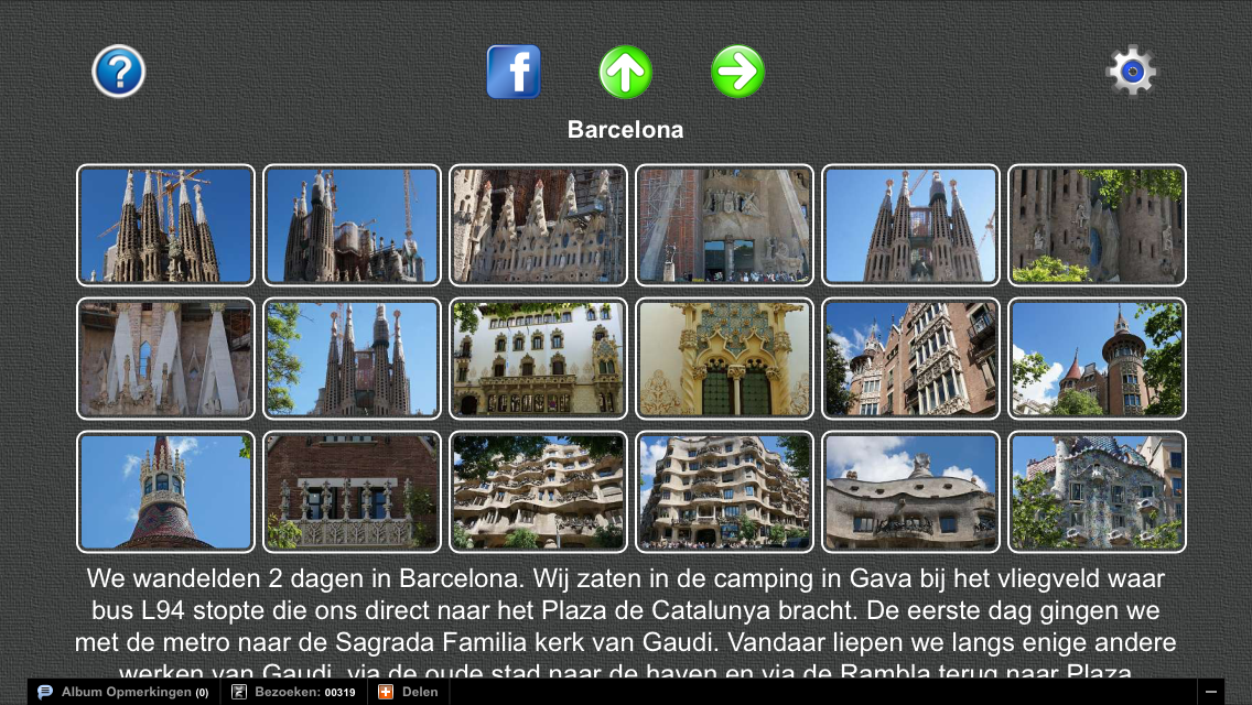
This shows the thumbnails of my Barcelona album on a monitor with a resolution of 1920x1080.
In the album settings we selected here a fixed-sape thumbnail layout of 9 columns and 10 rows, so that all 70 pictures were visible on the screen. The image bounds of the thumbnails was set at 240x160.
If we reduce the window width, the thumbnails will shrink:

This elastic design used in the PhotoSwipe and Slide Show 4 skin is based on the
good old html table structure and is works fine on Android tablets,
on the iPad and iPhone and on a PC with the Chrome and Safari
Browsers. It is not supported by Firefox and by the Internet
Explorer.
If we display this album on the small screen of an iPhone, the thumbnail gallery shows as follows:

In the responsive design you can hide the theme image on small devices, what has been done here. You see here all thumbnails on the screen, but in rather small shape.
You can enlarge the thumbnails somewhat by rotating the iPhone to landscape mode:

It looks better on an iPad:

Up to version 2.3 of the Slide Show skin you could improve this only by defining in jAlbum a limited number of thumbnails per index page. For instance if we set the number of rows to 3 and the number of columns to 6, we get larger thumbnails on the iPhone:
To see the other thumbnails you have to swipe to the left or click the green right arrow.
In version 2.3.1 of the Slide Show 4 skin and in the newer PhotoSwipe skin, we introduced a second display mode, where the number of thumbnails per rows is reduced if the area for the thumbnails is reduced.
We selected again a thumbnail layout of 9 columns and 10 rows, and image bounds of the fixed-shape thumbnails of 120x80.

If we now reduce again the window width, we see first that the number of thumbnails per row is reduced and finally you get the next display of 4 thumbnails per row:

On an iPhone this album looks as follows:

Use the area on the sides of the thumbnails to shift the thumbnails up or down with your finger.
On an iPad it looks as follows:

Try it yourself by opening my Barcelona album with variable number of fixed-shape thumbnails per row. The selected thumbnail image size is in this example 1000x100.
This way of presentation is in particular very useful if you have an album with a very large number of pictures which you like to present in one galery. A good example of such an album is my Nepal album, where also filters are used to create nice borders.
If an album contains also folder albums, the thumbnail folder icons are now displayed in a second table of thumbnail folder icons after the slide picture thumbnails of the top album. However it is the responsibility of the album creator that the folders are located after all normal images in the jAlbum Explore.
As you can see in the screen-dump of the Index page settings above, you can select the border color of these thumbnail folder icons.
Click here for an example of an album with folders with a variable number of thumbnails per row and thumbnails of different sizes and click here for the same album with a gallery of variable thumbnails per row but now with fixed-shape thumbnails.
The new implementation did not use html table tags, only div tags combined with CSS3 media queries. It was based on the article of Joshua Johnson How to build a Responsive Thumbnail , but in version 2.3.2 it is replaced by a design based on a table, as is also used in the Mirage skin of Chris Twist. This gives a nicer symmetrical thumbnail gallery which works fine on Android tablets, on the iPad and iPhone and on a PC with all browsers including Firefox and Internet Explorer.
The table design is in version 2.4.2 of the Slide Show 4 skin replaced by a <div> structure which gives equal spaces between the thumbnails and the number of thumbnails per row depends on the available screenspace on a row.
In version 2.6 of the Slide Show 4 skin and in the PhotoSwipe skin is a new thumbnails design implemented. This design is implemented without <table> tags. The table is constructed of floating <div>s.
So we have now 3 types of thumbnails presentations:
- An elastic thumbnails table which uses <table> tags. Supported by all mobile devices but on a PC Firefox and Internet Explorer do not support the resizing of the thumbnails. For an example click here.
- An elastic thumbnails table which does not use <table> tags. Supported in all browsers both on mobile devices and PCs. To see the same album in that design click here. To see an example with folders, see my Texel album.
- A responsive design where the size of the thumbnails does not change, but the number of thumbnails per row may change if the window/screen size is different. Supported in all browsers both on mobile devices and PCs. To see the same album in this design click here
.png)
Choose type 3 gallery by setting the 'Variable number of thumbnails per row' check-box. If that check-box is cleared an elastic table is used for the gallery. If check-box 'Don't use <table> tags is cleared, the classical html table structure is used in gallery type 1.
Click here to download and install newest version of the Slide Show 4 skin and click here to open the Slide Show 4 skin manual.
Geen opmerkingen:
Een reactie posten